Whether promoting your own brand or product, a local charity, or even creating a mobile lab, fleets now know that a vehicle without a wrap is a wasted opportunity. It doesn’t matter if the graphic incorporates the entire truck, just a trailer, or just a small portion of one side of the vehicle, what’s important is that the graphic design is clean, crisp, and gets your message across.
What follows are some leading examples of how fleets are leveraging vehicle graphics. The winners, chosen by the Fleet Owner staff, include our Editor’s Choice Award winner and a Special Mention honor. They all represent the impact that key words and images can have in effectively promoting a brand. So browse through the following pages as Fleet Owner presents its Annual Vehicle Graphics Awards finalists.
Editor's Choice
Company: Johnsrud Transport Inc.
Location: Des Moines, IA
Designer: Schneider Graphics, Des Moines, IA
Graphics Supplier: Schneider Graphics, Des Moines, IA
Marking Materials: 2 mil print vinyl, 3M IJ180Cv3 with 3M 8519 luster laminate
Inspired by one of its own drivers, himself a veteran, Johnsrud Transport offers its salute to the military with four themed tractors and one trailer in its 140-tractor for-hire fleet. When the bulk liquids hauler retired its fleet of red, white and blue patriotic Kenworth tractors, an Army veteran encouraged the fleet to continue the patriotic theme. Working with Schneider Graphics, the fleet chose this theme. Each of the tractors represents a branch of the military with a picture symbolic of that branch and a logo. The tractors also include a giant Eagle adorning the top of the hood.
The trailer represents all four branches of the military as well as the Coast Guard and continues the theme seamlessly with any of the four tractors, each driven by a military veteran. The trailer also has the company logo and the POW MIA logo on the rear. Formally unveiled on Veteran’s Day, Nov. 11, 2011, the trucks and trailer will travel through the Lower 48 states and Canada. “We believe it sends a message of appreciation to our military and serves as a reminder to the public of the importance of our men and women who serve and have served,” says Jackie Johnsrud, president & CEO.
Award Winners
Company: Modagrafics Impact Fleet
Location: Rolling Meadows,IL
Designer: Ben Berning, Modagrafics, Rolling Meadows, IL
Graphics Supplier: Modagrafics, Rolling Meadows, IL
Marking Materials: Avery Supercast EZ RS; Supercast Overlam
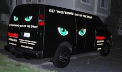
If you’re a graphics designer, what better way to promote your product than to include stand-out graphics on your own vehicles? That’s what Modagrafics did with its Impact Fleet, turning two of its vans into a visual demonstration of what it does best. Suggesting that companies get their brand “out of the dark,” the black vans incorporate large, reflective eyes that not only look eye-catching (excuse the pun) during the day, but provide a striking image of catlike eyes peering through the night.
Wrapped with the company name, telephone number, website, and services offered, the Modagrafics vans can’t be missed at any time of day.
Company: MillerCoors
Location: Milwaukee, WI
Designer: MillerCoors Design Firm, Milwaukee, WI
Graphics Supplier: Modagrafics, Rolling Meadows, IL
Marking Materials: Avery MPI1005 EZ
With a soldier saluting in front of the red, white and blue, it truly is High Life time for consumers who get a glimpse of any one of MillerCoors’ 30 trailers adorned with the new graphics. Designed to speak directly to the consumer, the trailers proudly welcome everyone back to the High Life while at the same time tugging on our heartstrings a little as we remember what it means to be an American.
“These graphics are circulating all throughout the U.S., and we believe that everyone who sees this design will feel proud to be an American, just like we are,” says Sandy Gallo,procurement manager.
Expected to last seven years, the new graphics enhance safety with their vivid appearance while protecting the trailer with an easy-to-clean covering.
Company: Kraft Foods Global
Location: Madison, WI
Designer: Sara Heller, TBWA/Chiat/Day, New York, NY
Graphics Supplier: Modagrafics, Rolling Meadows, IL
Marking Materials: Flex mount demountable panels and Avery MPI 1005 Supercast EZ
Mr. Peanut has arrived…in the peanut butter aisle. That’s what Kraft Foods wanted consumers to know as it rolled out its new advertising campaign for Planters Peanut Butter at the end of 2011. To raise awareness, the company outfitted 25 trailers in the Midwest with flex mount demountable panels with new graphics. On the panels is the iconic Mr. Peanut, who flies through the sky using his cane to pull back the curtain on shelves filled with the new peanut butter brand.
Letting the imagery tell the story, the language on the trailer is simple, yet effective: “Introducing Planters Peanut Butter.”
The use of the demountable panels will allow the company to update the marketing campaign with new graphics later this year.
Company: Ace Hardware Corp.
Location: Oak Brook, IL
Designer: Candace Davis, GSD & M, Austin, TX
Graphics Supplier: Signature Graphics, Porter, IN
Marking Materials: 3M 180
When Ace Hardware rebranded its paint department, the company wanted a way to sell the public on buying paint at local Ace stores. The concept Ace came up with has since been installed through graphics on 28 of the company’s 1,200 trailers. The idea was to engage consumers in a creative painting concept, the company said. The result is an eye-popping rolling advertisement. The trailers actually have two views of the same scene, depending on which side of the trailer you are viewing, as the painters work to paint the inside of the trailer with Clark & Kensington paint and primer. The graphics leave a lasting reminder of Ace and will help protect the trailers for up to 10 years, the company says.
Company: W.B. Mason Co.
Location: South Boston, MA
Designer: Bill Karb, W.B. Mason, Brockton, MA
Graphics Supplier: Lowen Graphics, Columbus, OH
Marking Materials: 3M non-reflective
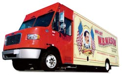
The image of the W.B. Mason delivery truck is about as much of a New England symbol as you can get. With their red fronts and “Who But W.B. Mason” text jumping off the sides of these delivery vans, the family- owned business proudly delivers office supplies and furniture as well as handling printing services.
While no longer just a New England company, the updated design on 125 of the company’s vans features a portrait of company founder William Betts Mason framed by two U.S. Flags. Also displayed is the company website, phone number, and its proud acknowledgement as the “official office supplies” supplier of the Boston Red Sox. “We feel that the new logo markets our history, our superior delivery, and our culture in a modernistic manner,” says John DiLuna, corporate fleet manager.
More award winners
Company: FTC Transportation
Location: Oklahoma City, OK
Designer: Jay Hare & Shawn Dininny, Speedway Children’s Charities, Charity Foundation for SMI, Harrisburg, NC
Graphics Supplier: Pro Cal Professional Decals, Rock Hill, SC
Marking Materials: 3M non-reflective, IJ180Cv3
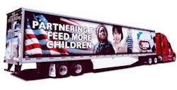
Feeding children is at the heart of the mission for Feed the Children and Speedway Children’s Charities. To help bolster awareness to the issues of childhood hunger, the organization sponsored a NASCAR Nationwide race on July 8, 2011, at the Kentucky Speedway. Prominently displayed at that race was the newly wrapped Feed the Children trailer. Reaching over 200,000 race fans over three days, the trailer helped deliver that message by stating the organization’s mission of “Partnering to feed more children” in bold type overlaid on a U.S. Flag.
With the pictures of three happy children and a box of food and a checkered flag at the front of the trailer, the graphics clearly identify the goal as well as the organizations involved with the movement. On the rear doors, followers of the trailer find a phone number, website (SpeedtoFeed. org) and a call to action urging people to “join our pit crew today!”
Company: Goodwill Industries of Central Florida
Location: Orlando, FL
Designer: Admark Graphic Systems, Huntersville, NC
Graphics Supplier: Admark Graphic Systems, Huntersville, NC
Marking Materials: N/A
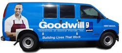
The new graphics on the 50 vans and trailers of Goodwill Industries of Central Florida were designed to support overall program marketing campaigns while assisting the organization in developing new programs and services as well as increasing donations.
“The new graphics enhance our image within the community,” says Anthony Edwards, transportation manager. “They provide a sense of empowerment and pride to Goodwill staff.” Using white lettering to complement the blue vehicles, the name Goodwill is prominently displayed, as is its slogan,“Building lives that work.”
Each piece of equipment includes a picture, evoking a personal connection to the vehicle and ultimately the organization, to reinforce the mission of Goodwill Industries. All trucks are marked with conspicuity strips to increase visibility of equipment and to heighten safety awareness for staff and other drivers.
Company: CleanScapes
Location: Seattle, WA
Designer: Mercury Group Limited, Seattle, WA
Graphics Supplier: SuperGraphics, Seattle, WA
Marking Materials: 3M IJ 180 with luster laminate
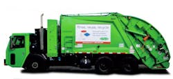
Instead of just suggesting people recycle, the vehicle fleet at CleanScapes issues a call to action—five of them, in fact. Five different messages have been added to 75 vehicles in the fleet, each with its own advice. They are: Rinse, reuse, recycle; TVs are not trash; Junk the junk; Let it be; and Hauler.
The themes are designed to convey the different ways people can increase waste diversion, not just simply placing products in their proper recycling bins.
“Rather than focusing solely on proper sorting technique (which items go in the recycling bin vs. organics bin vs. garbage), we wanted to offer clear suggestions for reducing the amount of material that ends up in any of the bins,” says Chris Martin, president.
The simple design of the graphics—black lettering and basic graphics on a white background—allows for easy updating while ensuring that the advice is easily seen and extends the company’s brand throughout the communities it serves.
Company: Reba Transport
Location: Berne, IN
Designer: Modagrafics and Smith Brothers Furniture
Graphics Supplier: Modagrafics, Rolling Meadows, IL
Marking Materials: Avery Supercast 2 mil non-reflective
Every fleet wants its graphics to reflect its values. Reba Transport, the private fleet of Smith Brothers Furniture, accomplished just that with its redesign of four of its fleet trailers.
“Our customers love the understated elegance [of the design] that is in line with the furniture we deliver,” says Kevin Nussbaum, fleet operations manager. “We do not try to cover up a poor product with flash and showmanship. In short, our design represents our company’s product and culture.”
From the company logo and website at the front of the trailer to the design element that integrates the rear of the trailer with the sides, the art elements perfectly frame the company name located in the center of the trailer. The design is restrained, yet clearly communicates the message Smith Brothers is delivering.
Company: Hollandia Produce
Location: Carpinteria, CA
Designer: Bill Schoneberger, Clear Concepts, Santa Barbara, CA
Graphics Supplier: Epic Media Group, Manhattan Beach, CA
Marking Materials: Kwik Zip heavy duty vinyl; 3M reflective decal
If you’re hauling fresh lettuce, it’s nice when your trailer looks as fresh as the product. For Hollandia Produce, its new vehicle wrap projects just that image. The company’s packaging for its butter lettuce was a 2011 Impact Award winner for excellence in packaging. That excellence now extends to its trailer wraps.
The trailer graphic incorporates the same award-winning design, serving as an extension of the product’s packaging.
“There are many items on the grocery shelves; it is too easy to be overlooked,” says Pete Overgaag, president. “But they can’t miss our trailer. Since everyone is a potential customer, our trucks out on the public streets are the perfect advertising vehicle.”
Proudly incorporating the product packaging on the side of the trailer (“Live Gourmet. Living Butter Lettuce. Absolutely Fresh Because It’s Still Alive!”), the trailer makes good use of the space. With a fresh head of lettuce at one end and a picture of the product as it appears on store shelves on the other, trailer space is not wasted yet does not overwhelm the messaging. Even the trailer’s side skirt is put to use, touting the fact that the product is “hydroponically grown in Carpinteria, California.”
Company: Wholly Guacamole
Location: Saginaw, TX
Designer: Andrea Wilson, Square 1 Agency, Dallas, TX
Graphics Supplier: Signature Graphics, Porter, IN
Marking Materials: 3M 180/680 Series
According to Wholly Guacamole, you’ll have to “ ‘Like’ us on Facebook because they don’t have a ‘Love’ button.” And with that, consumers are immediately drawn to the two-tone graphics on the side of 10 trailers from Wholly Guacamole. Accompanying the text are two chips displaying their love for each other by holding hands over a bowl of guacamole. Add in the key selling points of the product—all natural, no additives, no preservatives, cholesterol-free, and gluten-free— and you have a classic advertising venue for “America’s No. 1 guacamole.”
Tracy Altman, vice president of marketing, explains that the design of the trailers reflects the product packaging, creating uniform brand identification. “With more than 1.5 million boxes sold per month through retailers like Wal-Mart, Safeway, and Costco, Wholly Guacamole is dedicated to maintaining a streamlined fleet of trailers that looks as good as their products taste,” says Altman.
Special Mention
Company: Meritor
Location: Troy, MI
Designer: Colleen Sadlik, CMS Designs, Ferndale, MI
Graphics Supplier: EEI Global, Rochester Hills, MI
Marking Materials: 3M Comply
Don’t follow the Meritor Vehicle Dynamics Laboratory trailer too closely lest you upset the important work going on inside this mobile lab. At least that’s the impression left thanks to the trailer wrap on the rear roll-up door, which shows two Meritor employees “working” inside the trailer, testing the latest technologies the company has to offer.
The wrap on the trailer, which is a working R&D lab that travels throughout North America to showcase Meritor products and their capabilities, includes language detailing Meritor’s six business units (truck, trailer, aftermarket, specialty, off-highway, and defense) along with the company’s website. Of course, there is also the globally recognized Bull logo and company colors to reinforce the brand.
The new graphics include brushed metal design to help hide dirt, which is important for a rolling lab such as this one.
