"The most beautiful curve is a rising sales graph."
--Raymond Loewy (1893-1986)
If everyone views trucks merely as machines highly engineered to accomplish very specific tasks, then why does anyone care what they look like?
I think it’s safe to say most of us would agree that commercial vehicles, from pickups to heavy haulers, are remarkably more “good looking”-- especially when on the go— than they were only a generation ago.
Thirty-odd years back, when I started covering this business, I didn’t give any thought to what most fleet trucks looked like. Mainly because they looked pretty much the same as the ones I’d seen as a boy.
Their look was wholly utilitarian. They were no-fuss “rolling stock,” which was how fleets invariably referred to them.
It was the escalating fuel prices of the ’70 on into the ’80 that ultimately brought on the golden age of truck design that benefits the industry still.
The first responders to that crisis were makers of add-on aerodynamic deflectors.
They helped save fuel and added a dash of swoopy smoothness to the squarely shaped trucks of the day. But as bolt-on appendages, they did not soften the overall hard-charging look of the high cabovers and long-nose conventionals of the day.
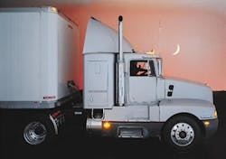
Then in 1985 came the rollout of the radically aerodynamic and thus game-changing Kenworth T600. The tractor’s development had begun some years before as the project had been launched in response to the 1973 oil crisis.
1985 Kenworth T600: The true beauty of the "Anteater" was its wind-cheating curves
An engineering team led by the late Larry Orr, then Paccar’s R&D chief, strived to design a tractor that would be aerodynamic enough to be significantly more fuel-efficient than a long-nose conventional (it was— by a whopping 22%) yet deliver all the other attributes expected of a freight hauler.
Orr’s team also gave the sloped-hooded Anteater— the nickname awarded it by truckers-- a set-back front axle to improve front-axle loading and a much smaller turning radius than other conventionals. And the T600’s sleek design also threw off 50% less splash and spray than other models.
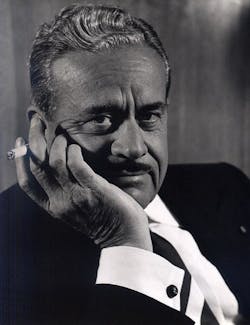
I’ve no way of knowing if Orr and company were inspired in their efforts in any way by Raymond Loewy, long honored as the “Father of Industrial Design.”
French-born Loewy made the U.S. into the epicenter of 20th-century industrial design
Loewy is credited with “streamlining” American industrial design. His mastery of applying visual-design aesthetics to mass-produced objects during a career that spanned four decades knows no parallel to this day.
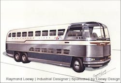
The transportation-related clients of the Franco-American designer ranged from International Harvester (Metro vans/trucks of the ‘30s), Chrysler, Ford, GM and Studebaker (as in the Avanti!) to Greyhound Lines (the Scenicruiser motorcoach) to Shell Oil (its literally perfect wordless logo) to the interiors of NASA spacecraft, including the once-orbiting Skylab.
Sketch penned by Loewy for his design of the Greyhound Scenicruiser motorcoach
But what really sets Loewy apart in the annals of American business is that he could look beyond his own visual genius and see the whole commercial picture.
Loewy summed up the intersection of design sense and dollars and cents as cleanly as he shaped countless products. "Good appearance was a salable commodity,” he once stated, as “it often cut costs, enhanced a product's prestige, raised corporate profits [and] benefited the customer.”
What he sketched out on paper to enhance the “look” of everything from the iconic Coca-Cola bottle to Pennsylvania Railroad locomotives invariably also improved their functionality.
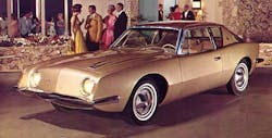
The Loewy-sculpted Studebaker Avanti speaks for itself in this glossy print ad
“While Loewy introduced slanted windshields, built-in headlights and wheel covers for automobiles, he also advocated lower, leaner and more fuel-efficient automobiles long before fuel economy became a concern.”
When he was engaged to lead a team given just 40 days to perfect the still stirringly seductive design of the Studebaker Avanti, Loewy put up a sign declaring that "Weight is the enemy."
One upshot was the rakish luxury coupe had no grill.
Loewy’s take on that neatly reflects how he could meld style and substance: "In this age of fuel shortages [this was in 1962!], you must eliminate weight.” Then he added the kicker: “Who needs grills? Grills I always associate with sewers."
There you have it, the secret of good design.
And from there, we may surely infer that when it comes to trucks, beauty ought to be, well, much more than sheet-metal deep.


